Product Research
Current app content analysis
I conducted a content analysis to identify potential gaps and opportunities in the redesign. The analysis helped us make decisions about what to prioritize with the given content.
Team project to whose goal was to redesign an existing product used during the pandemic. According to Think Google keyword trend data there were 80% more searches for “diy” in 2020 vs 2019. This trend shows a shift of people acquiring new skills and being creative in their homes while being quarantined during the onset of the Covid-19 pandemic. Instructables is a well known brand and was used during this time, but the app has many faults in the user experience as noted by users. We redesigned the app with a more up to date interface and overall better user experience on mobile.
People wanted to share their projects online as physical socializing had been halted. However, there are many platforms to choose from for sharing content and this created a problem with people having to switch between multiple apps and webpages to follow their favorite creators. Many DIYers use Instructables to post their content but the need to use the desktop version of the site instead of a dedicated app frustrates users. In addition, Instructables do not allow cross platform embedding of content, so users would have to open multiple apps to stay up to date with their favorite DIY creator’s posts and in doing so the DIY creator’s social branding suffers in building and maintaining an audience in the DIY community through one dedicated app.


I conducted a content analysis to identify potential gaps and opportunities in the redesign. The analysis helped us make decisions about what to prioritize with the given content.
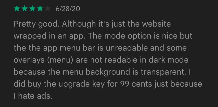
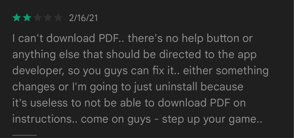
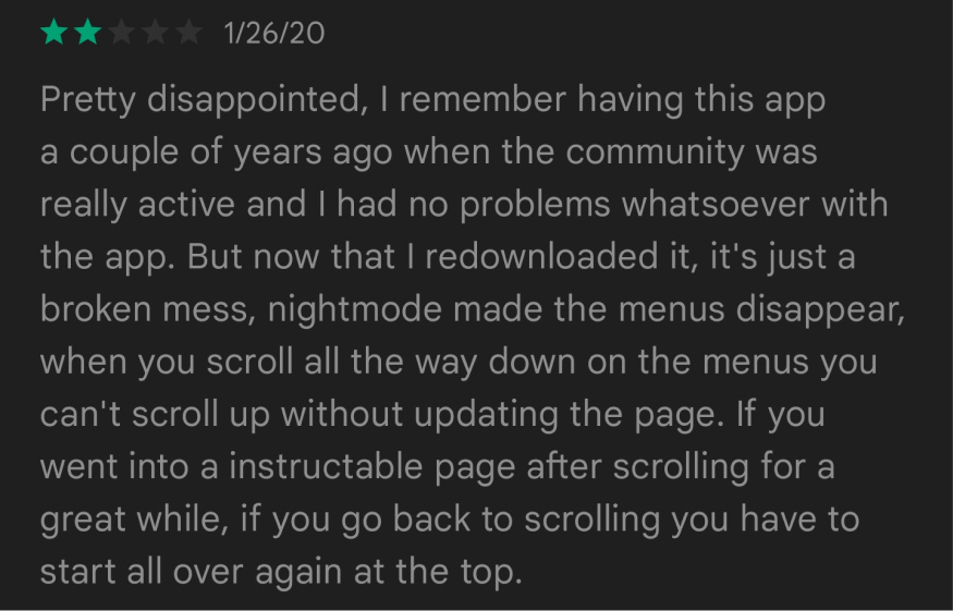
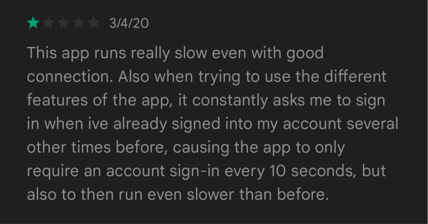
I started my user research by reading through the app store reviews to find out what issues users were facing. Most notable comments were users expressing their frustration on the app’s UI and it feeling like the desktop site instead of a more mobile app experience.
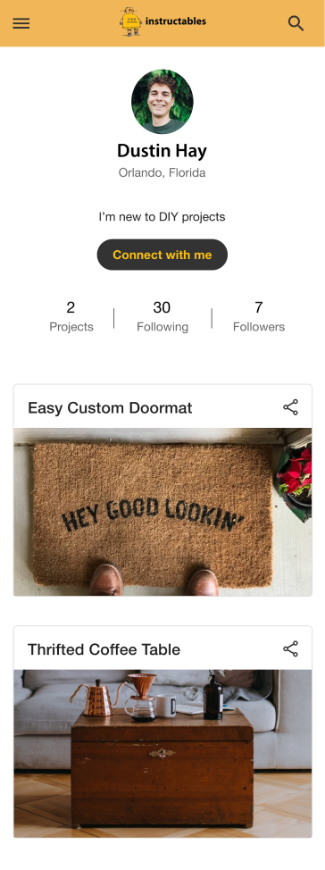
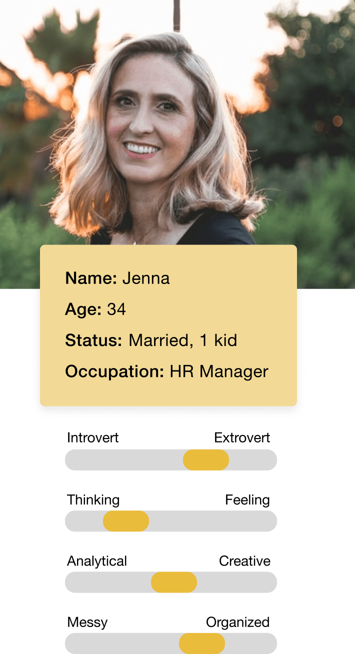
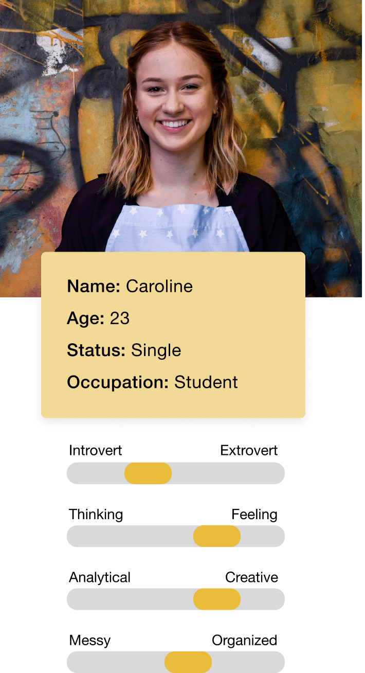
I then recruited some potential users and led a discussion on their thoughts on the app’s functionality, how they would use it in their lives, and what improvements they would like to see. To ensure the focus of the redesign met user’s needs, I compiled the feedback received in the discussion and the app reviews to create these personas.
I find so much joy in creating that sharing my work with others motivates me!
Jenna is a wife and mother of one, who spends time crafting with her kid as a hobby. She is very organized and tidy at work, but that does not translate to her home life. Because her child is at a young age, she finds herself getting disorganized and losing track of her progress in their crafts since they get distracted easily. She is very family oriented and love to keep her family and friends updated with what she and her child have crafted together.
I love my hobbies as they give me something to focus on outside of classes.
Caroline is a student and outside of class she partakes in many hobbies. She would like a way to combine all her hobbies in a single app instead of an app that focuses on just one. She finds a lot of crafting apps cater to an older audience and would like one that also is for people her age. As a student she finds it important to save money and will not use products that require a subscription to use.
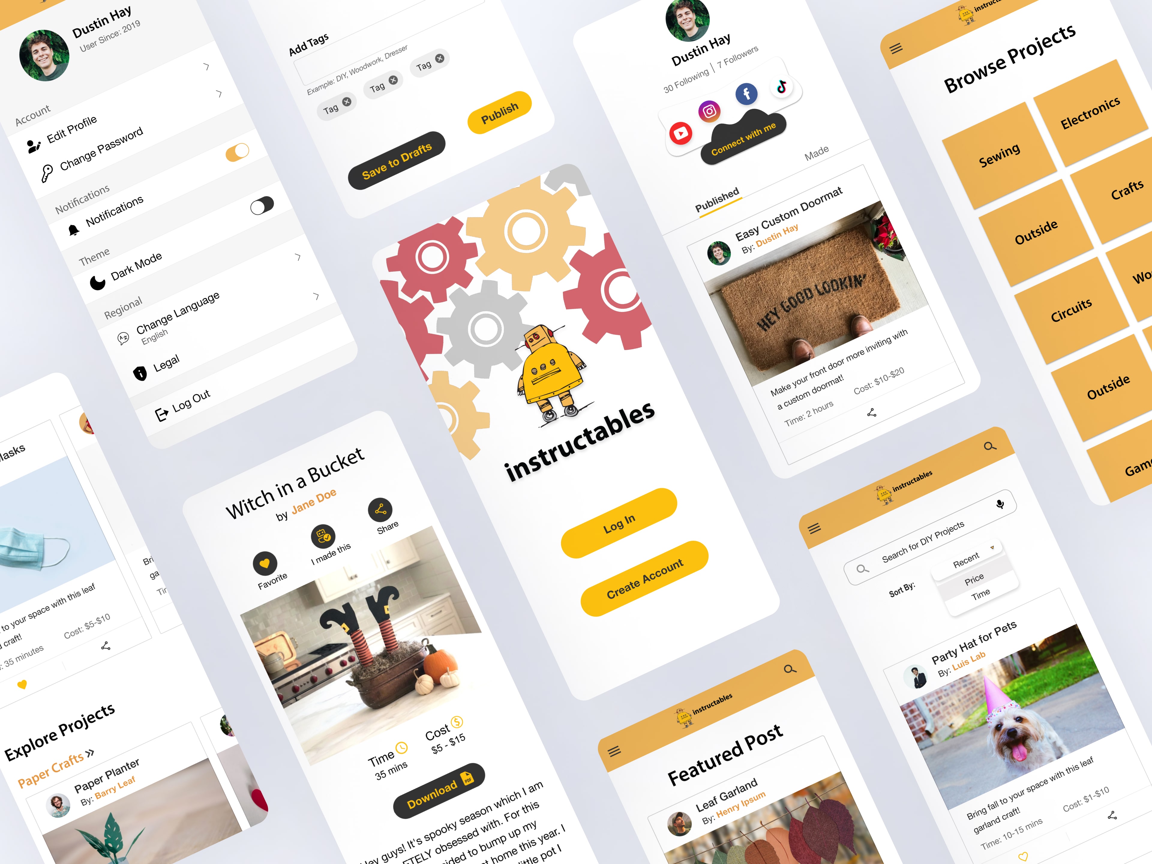
Most of the users will be coming from a mobile device. Developing this project with a mobile-first approach will improve issues that Instructables currently face.
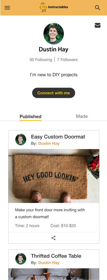
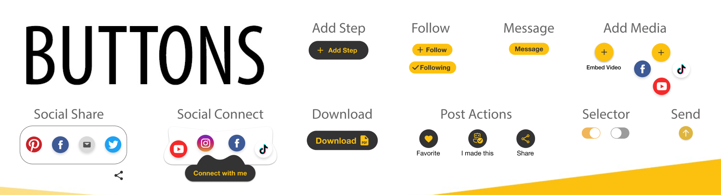
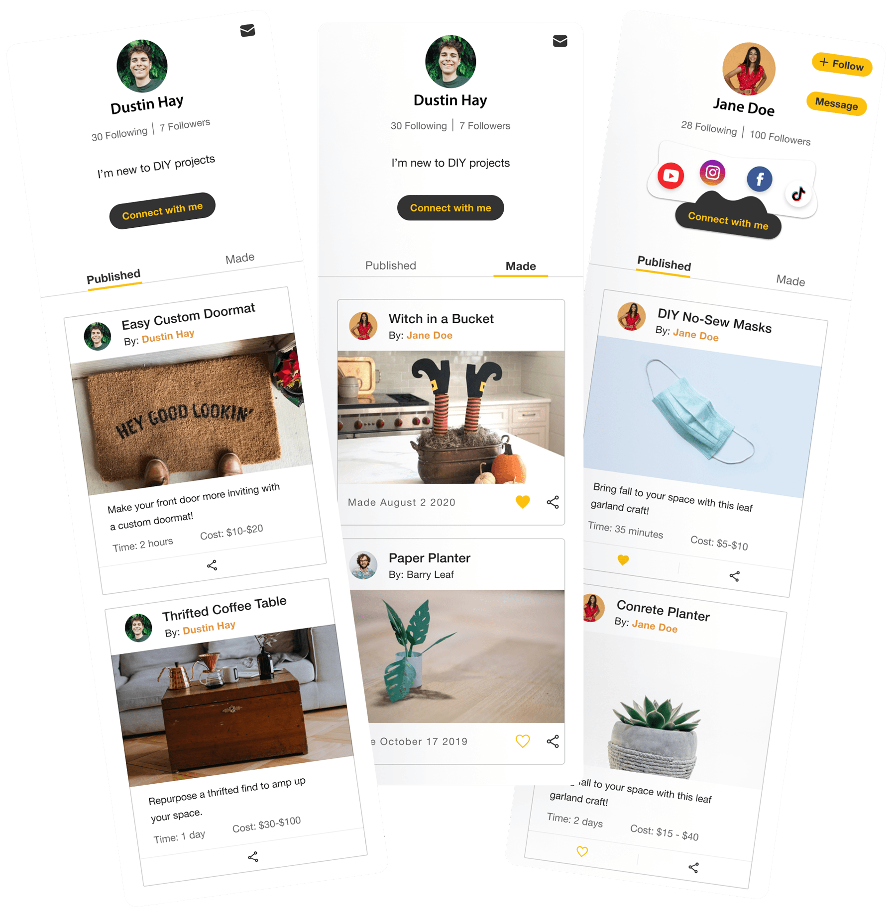
With social sharing being a common interaction of DIY users, adding this feature would elevate the user’s connection to the app and their followers.
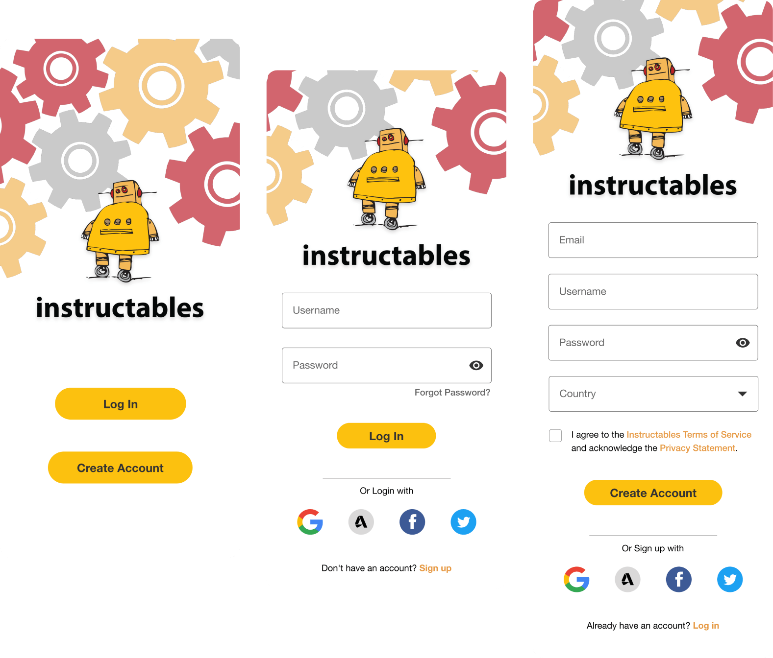
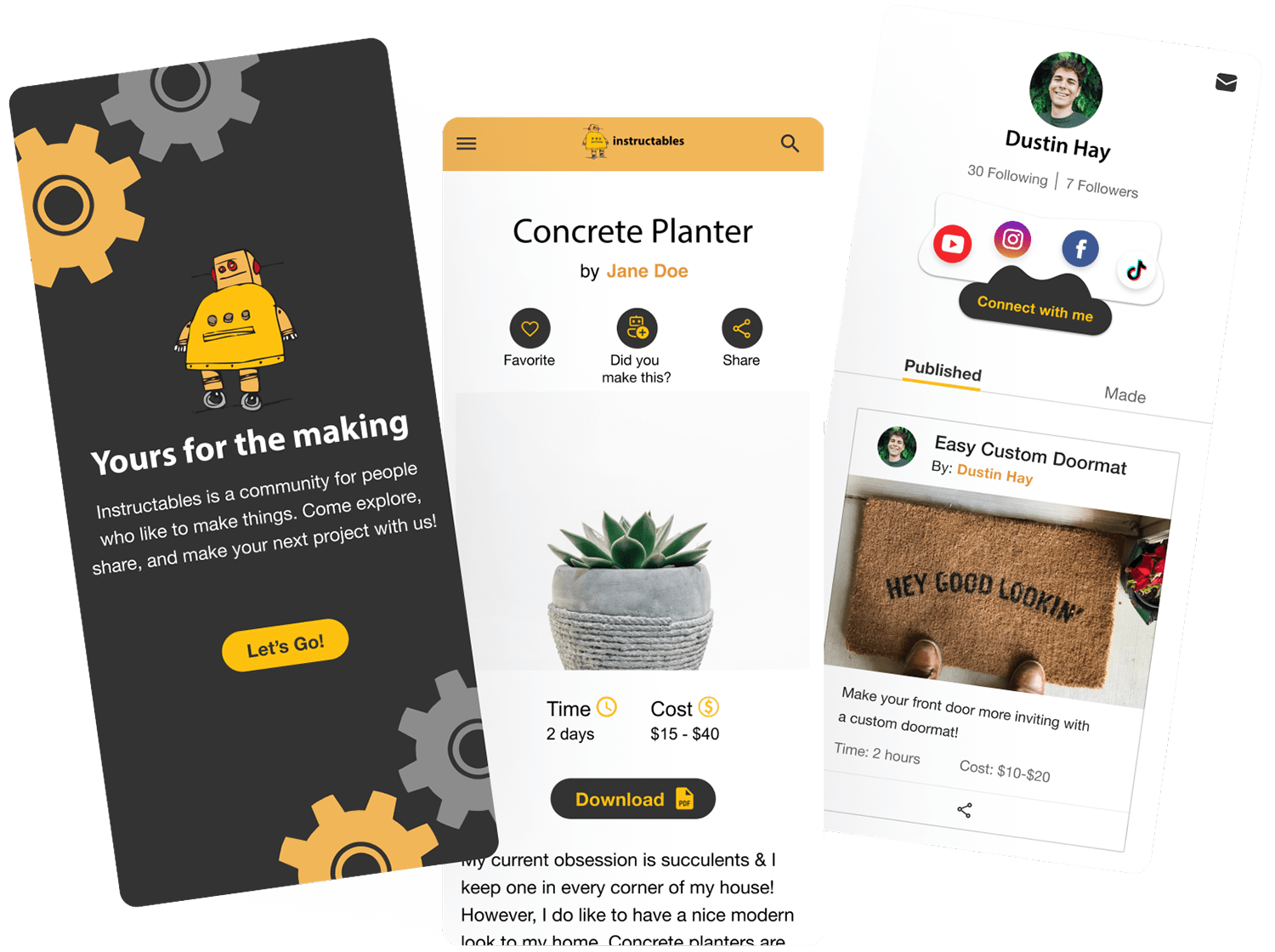
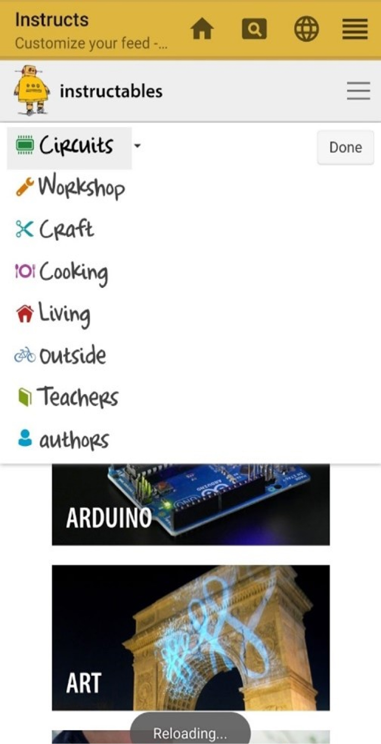
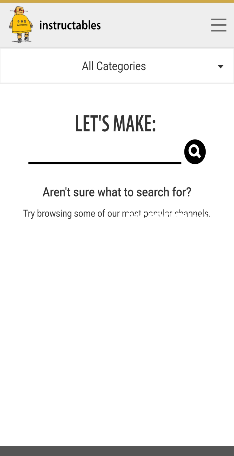
The fastest way to gain the interest of users is the landing page. The landing page should display relevant information to the user such as name of app (Instructables), logo, brand styling, and sign-up/sign-in.

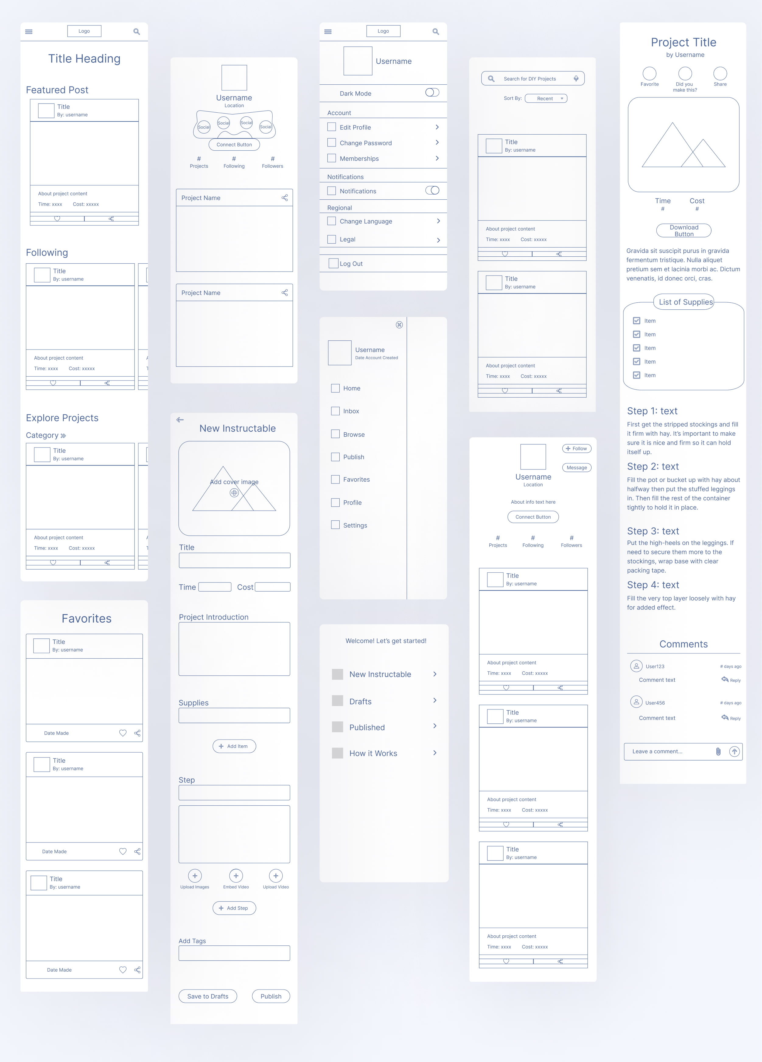
I recruited some users who fit within the persona to test the initial prototype. Before continuing the redesign and further fleshing out pages, I needed to validate the concept and if they understood how to navigate the app and their thoughts on the functionality. I tasked them with 3 different scenarios and used this feedback to create user flows of possible interactivity within the app and to identify any pain points in the initial design process.
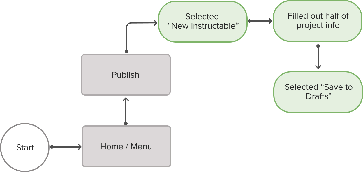
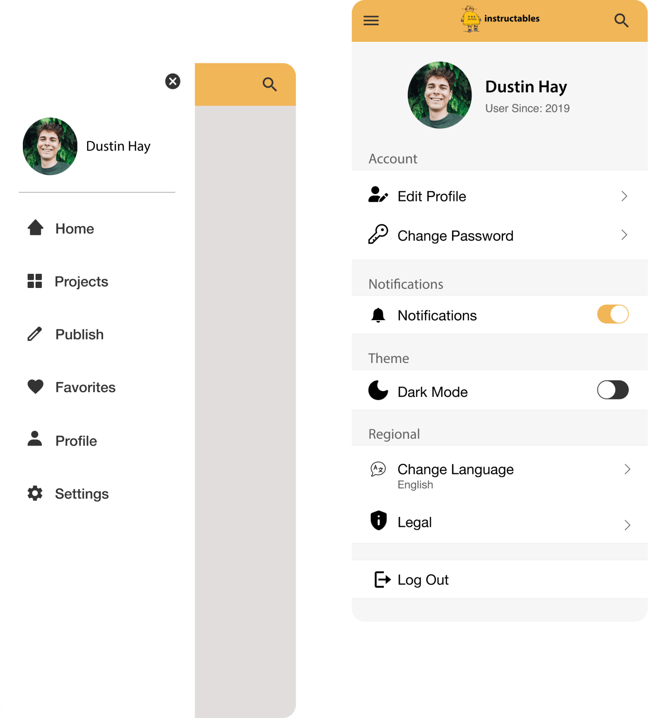
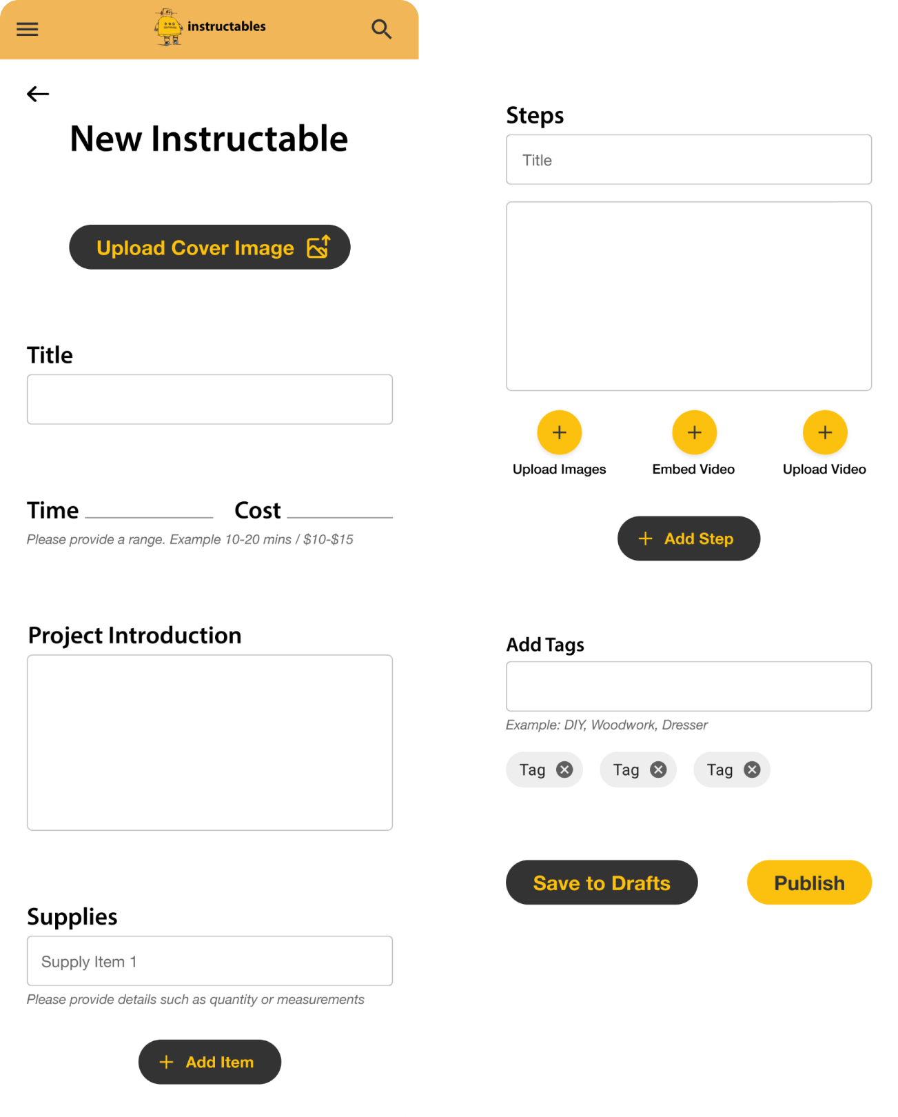
Users completed task and met expectations on the flow to achieve the task. I further questioned how would they like the confirmation that the project was saved to their drafts? Answers i received were: A modal / pop up confirming it was saved, being redirected to the drafts page with the project shown, a button change to a checkmark or text changed to “saved to drafts”.
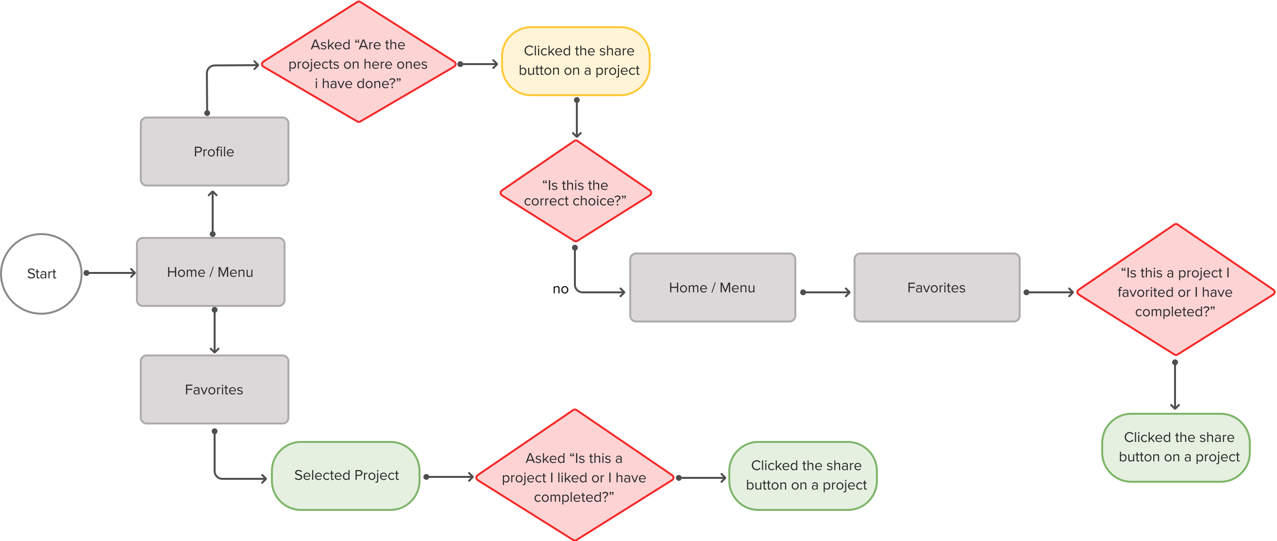
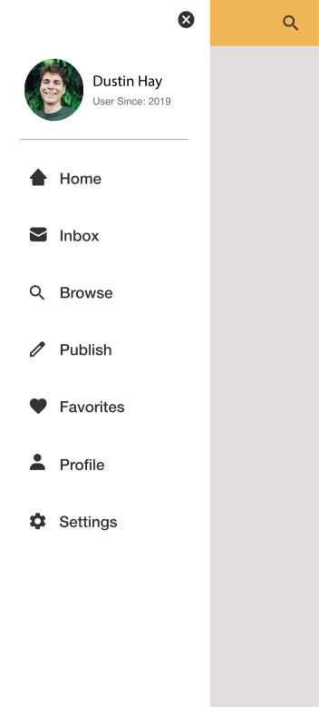
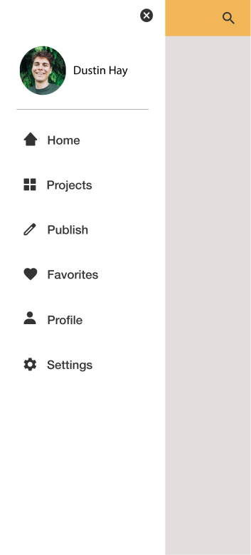
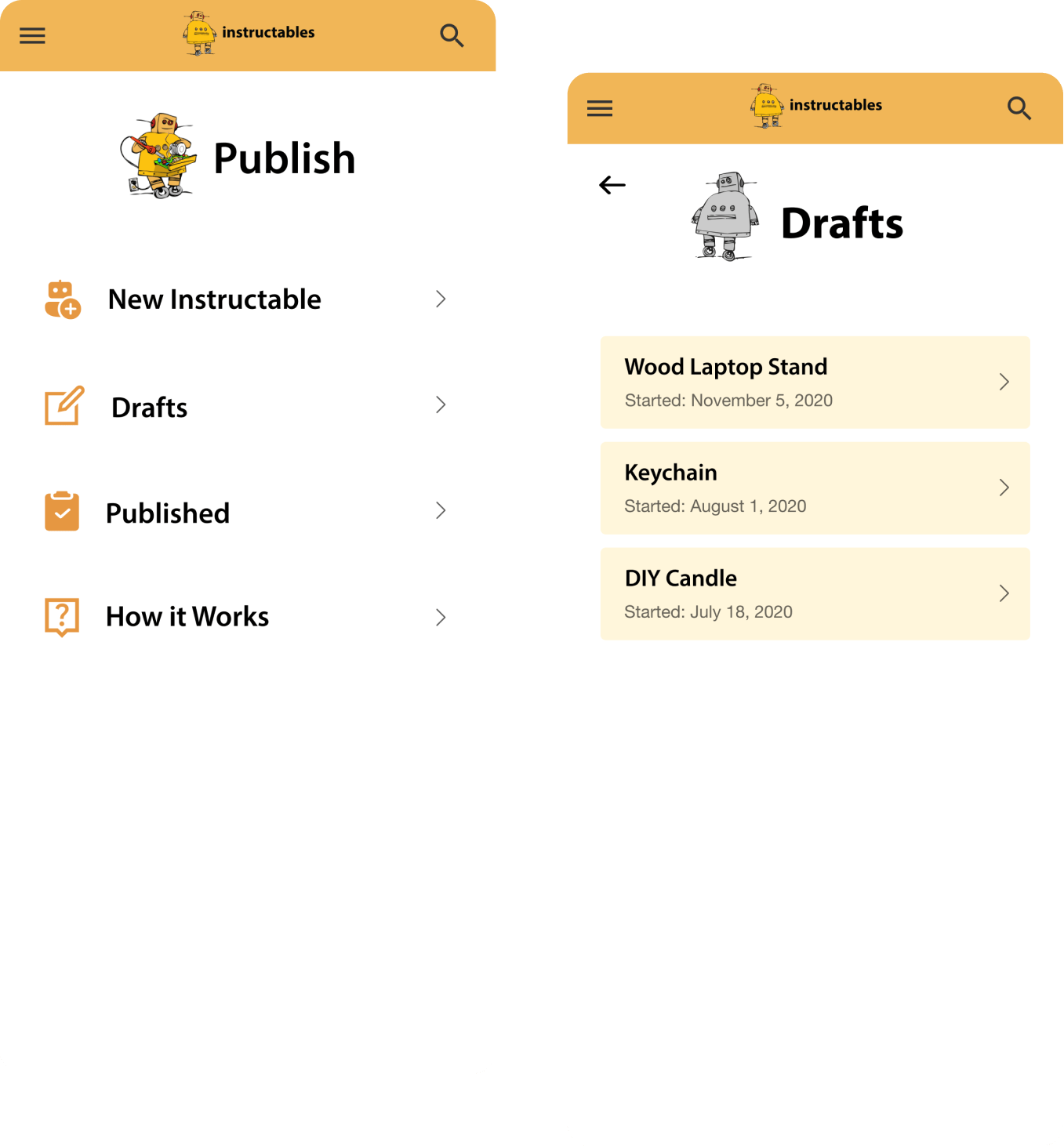
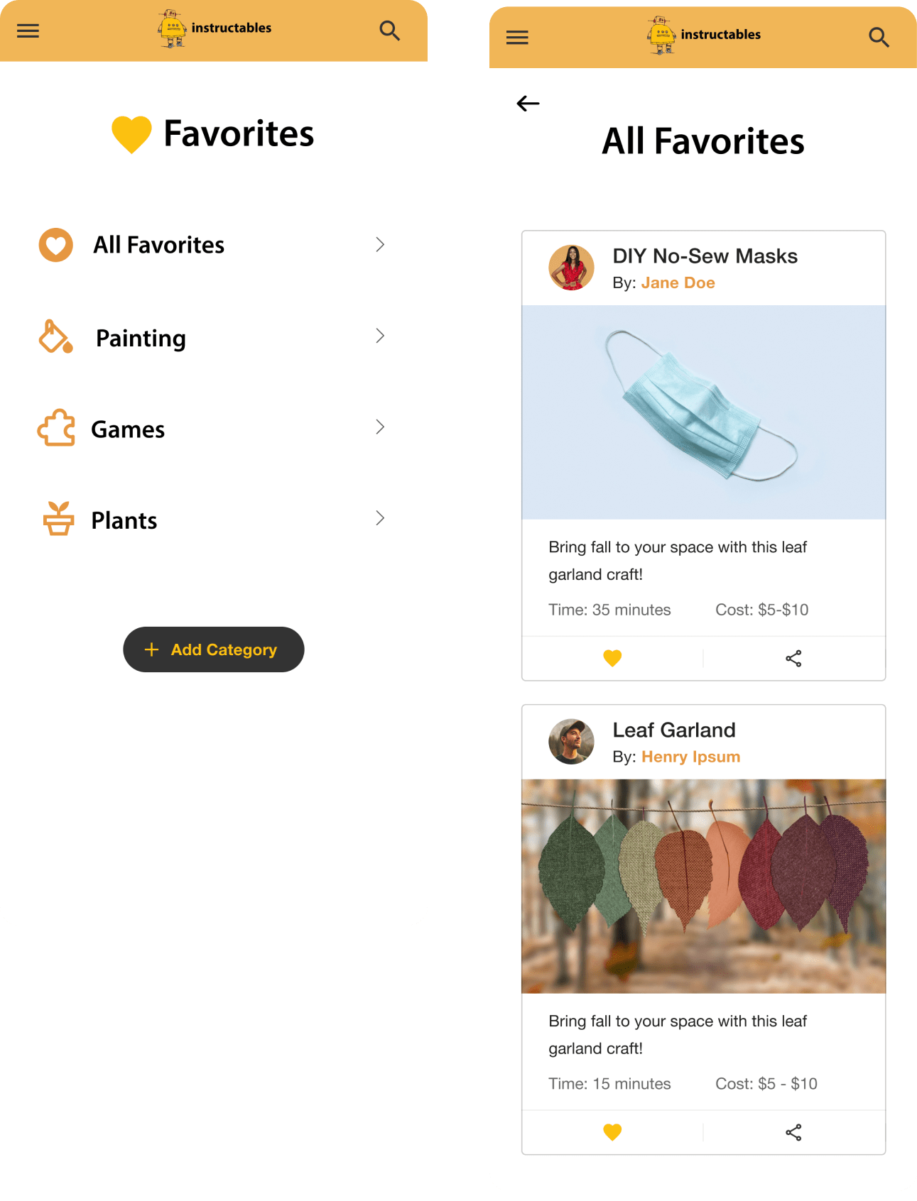
While some users opened the menu & chose the favorites page, others expected it to be on their profile. Additionally, the users were confused if “Favorite” meant liked or completed, or both. I then further questioned if “Favorites” and “Projects Completed” were different categories for them and they said yes. They would want to “favorite” a post so they can remember it & save it to go back to when they are ready to do it, which separates it from projects they have completed. This made me consider if I had tasked them with Find projects you have published - would the outcome be the same?
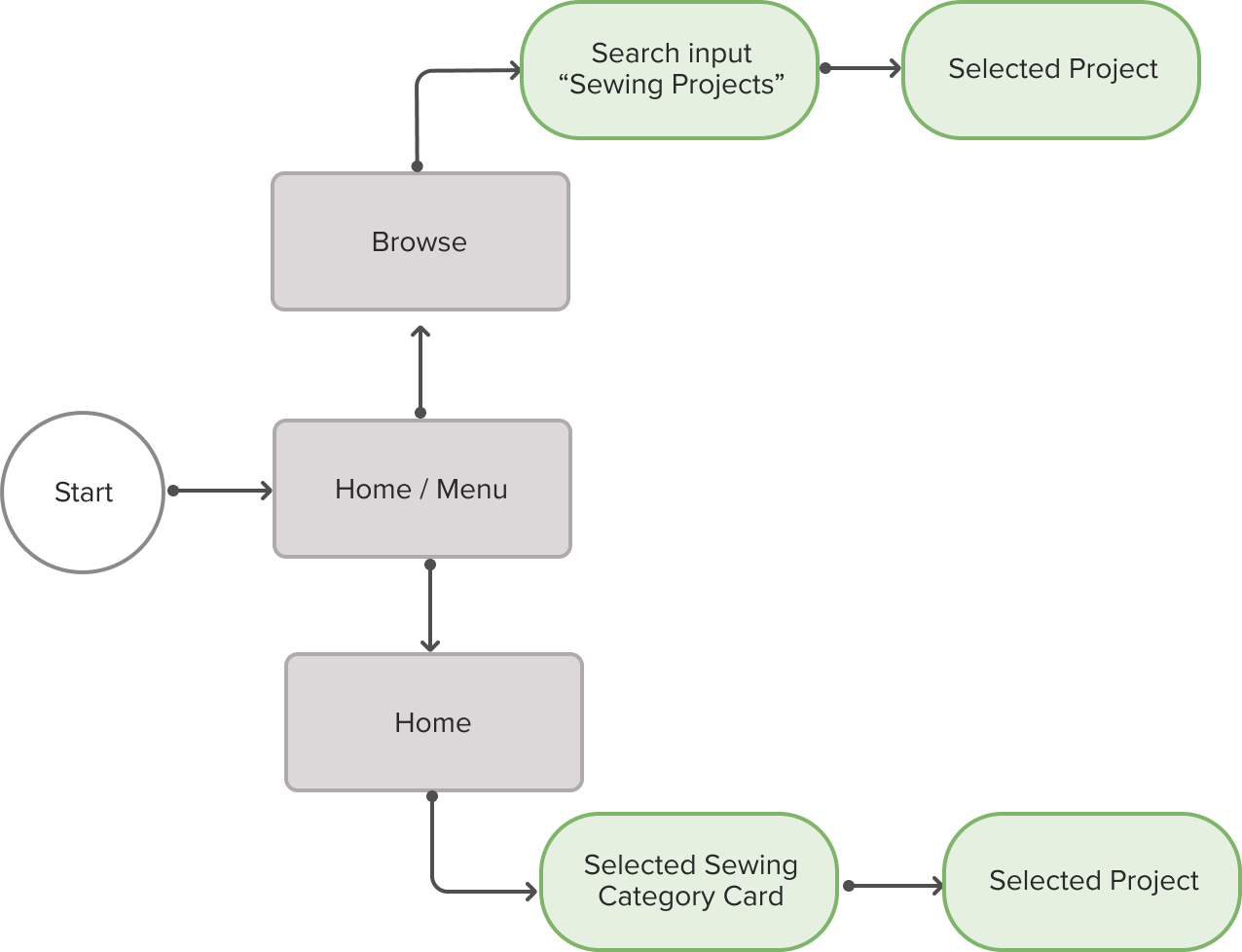
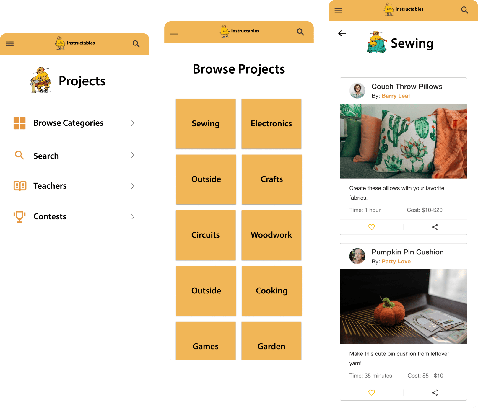
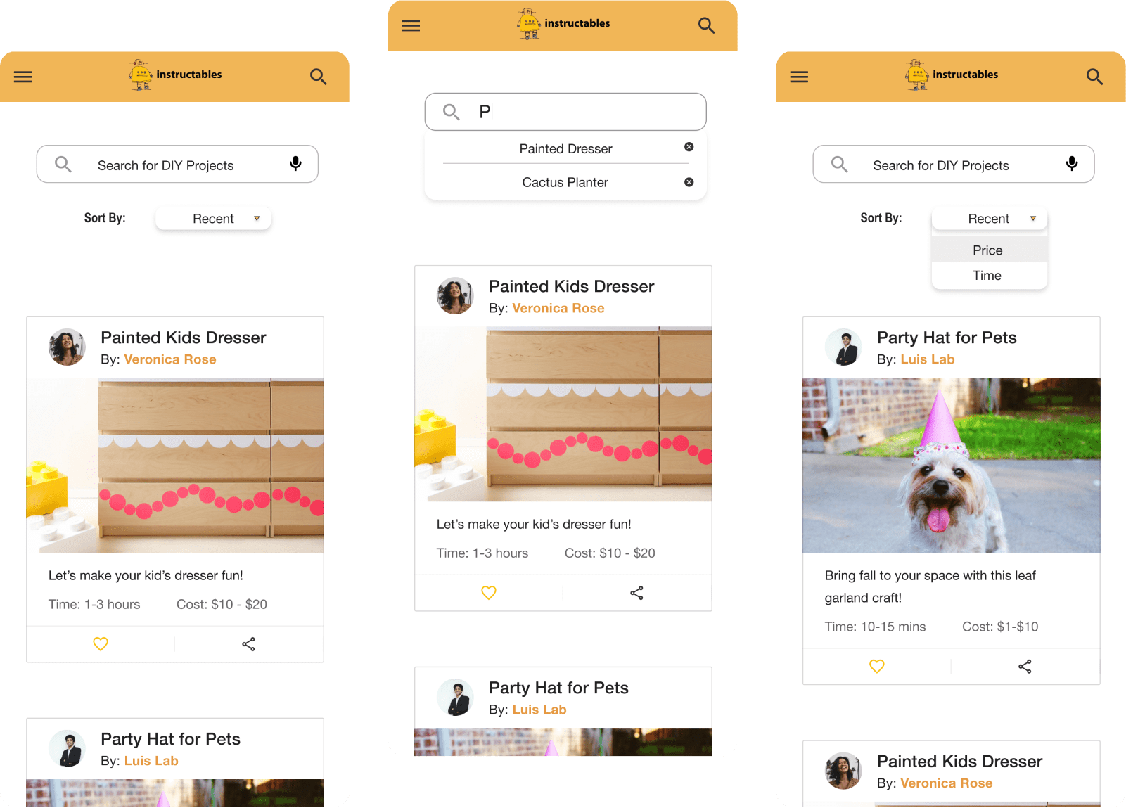
There are 2 flows to complete this task and users completed it both ways. I asked users if they had considered a different way to complete their task. Most stated the search bar or the browse functionality met their expectations to complete the task and did not propose a way that would be easier or more intuitive than what was already presented to them. Some users commented that a way to navigate to just “Projects” and to find the Browse categories from there would have been helpful. One user commented that they thought the Browse menu item was the search page as the icon represented search to them. This did not frustrate them nor did it impede them completing their task.